Financial news only tells you what happened yesterday, often leading retail traders to buy at the top. A stock chart, however, gives you a real-time window into what smart money (institutional investors and hedge funds) is accumulating right now.
Learning to read stock charts boosts the accuracy of your market predictions. This technical analysis helps evaluate real-time market behavior over emotional noise. By identifying trendlines and decoding price action, you can optimize your trading strategies and manage risks effectively.
Mastering these visual skills isn’t just about reading graphs; it is about building a disciplined, data-driven approach to navigate market dynamics and protect your capital. Let’s dive in and master these essential techniques.
Quick Takeaway: What is Stock Chart Analysis?
Stock chart analysis (or technical analysis) is the practice of evaluating historical price movements and trading volume to identify high-probability patterns, gauge market sentiment, and forecast future price trends. Instead of relying on delayed news, chart analysis focuses directly on real-time market behavior.
Why Master Stock Chart Analysis?
If you trade without reading charts, you are essentially gambling. Mastering these visual skills isn’t just about reading graphs; it is about building a disciplined, data-driven approach to navigate market dynamics and protect your capital.
Here is why this skill is non-negotiable for serious investors:
- Stop Buying High and Selling Low: Without a chart, beginners usually give in to FOMO (Fear Of Missing Out) and buy at the very top of a rally, only to panic-sell at the absolute bottom. Charts reveal key support levels so you know when a stock is overextended.
- Track Institutional Footprints: Retail traders don’t move market prices—billion-dollar institutions do. Charts reveal where big banks are silently accumulating shares before a major price breakout occurs.
- Know Your Exit Strategy Before You Enter: A chart answers the two most critical financial questions: Where do I take my profits? and At what exact price do I cut my losses if I am wrong?
In this comprehensive, step-by-step visual guide, we will strip away the fluff. You will learn the exact mechanics of reading a trading graph, identifying market trends, validating breakouts with volume, and executing high-probability trades with confidence.
1. The Core Components of a Trading Graph (X-Axis, Y-Axis & Timeframes)
Before you can spot complex technical signals, you need to understand the basic anatomy of a trading graph. Regardless of the platform you use—whether it’s TradingView, Yahoo Finance, or your brokerage app, every stock chart is built on the same core grid.
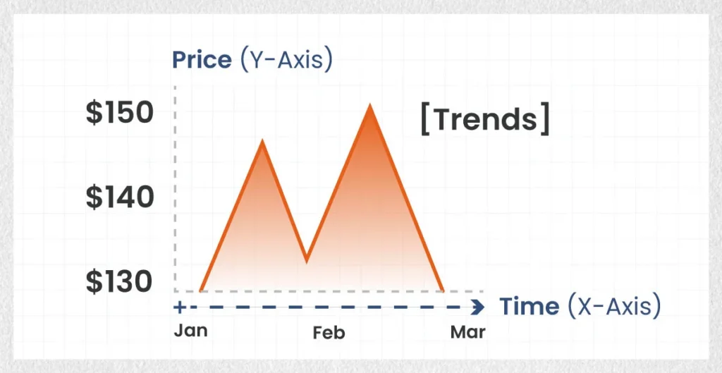
The Y-Axis (Vertical Line: Price)
The vertical axis on the right or left side of the chart displays the price of the stock. As the stock price rises, the line or bars move upward; as the price falls, they move downward. Price changes are calculated in real-time during market hours.
The X-Axis (Horizontal Line: Time)
The horizontal axis along the bottom represents time. Depending on your settings, this axis can track time in minutes, hours, days, weeks, or even years.
Choosing the Right Timeframe for Your Strategy
Selecting the appropriate timeframe is critical because a stock might look extremely bullish on a 5-minute chart but remain in a severe downtrend on a weekly chart.
- Intraday Timeframes (1-minute, 5-minute, 15-minute): Used primarily by day traders who open and close positions within a single trading day to capture fast, small price fluctuations.
- Daily Timeframes (1-Day): The standard view for swing traders holding positions for days to weeks. Each bar or data point represents one full trading day.
- Weekly & Monthly Timeframes: Used by long-term investors to evaluate the overall health and macro trend of a stock over several months or years, filtering out short-term market noise.
2. Chart Types: Line Charts vs. Candlestick Charts
When conducting chart analysis, the visual format you choose dictates how much information you receive at a glance. While there are several graph styles available, two dominate the trading world.
Line Charts (Best for Simple Overviews)
A line chart is the most basic type of trading graph. It is created by connecting a series of data points, usually the closing price of each time period with a continuous line.
- Pros: Clean, uncluttered, and easy to understand at a glance.
- Cons: Hides critical price action that occurs during the trading session, such as intraday highs, lows, and opening prices.
- When to use: Use line charts when you want a quick, macro-level overview of a stock’s long-term direction without getting overwhelmed by details.
Candlestick Charts (The Gold Standard for Trading)
Originating in 18th-century Japan for rice trading, candlestick charts are the undisputed tool of choice for modern financial market participants.
Unlike a line chart, a single candlestick provides four critical pieces of data for any given timeframe, commonly referred to as OHLC:
- Open: The price when the timeframe began.
- High: The highest price reached during the timeframe.
- Low: The lowest price reached during the timeframe.
- Close: The final price when the timeframe ended.
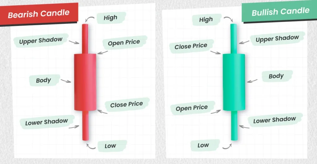
Anatomy of a Candlestick:
- The Real Body (Wide Section): Shows the price range between the Open and Close.
- Green (or White) Candle: Represents a bullish period where the closing price was higher than the opening price (buyers were in control).
- Red (or Black) Candle: Represents a bearish period where the closing price was lower than the opening price (sellers were in control).
- The Wicks/Shadows (Thin Lines): The thin lines extending above and below the real body represent the highest and lowest prices traded during that period.
Tips for Deep Learning:
While individual candles show you who won the immediate battle between buyers and sellers, specific combinations form predictable patterns that signal major market reversals or continuations.
3. How to Read Stock Market Trends (Uptrend, Downtrend & Consolidation)
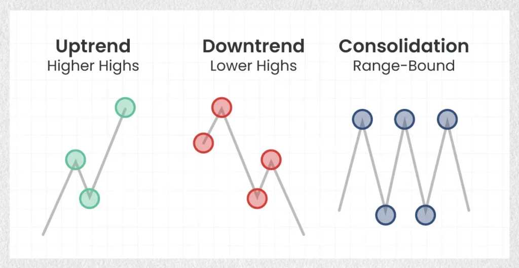
One of the most famous adages on Wall Street is: “The trend is your friend.” Before placing any trade, your primary objective when learning how to read the stock market is to identify the overarching trend direction. Markets move in three directions: Up, Down, or Sideways.
Uptrend (Bullish Market)
An uptrend is characterized by a series of Higher Highs (HH) and Higher Lows (HL).
- Even though the price fluctuates, every peak reaches a higher level than the previous peak, and every pullback stops at a higher level than the previous pullback.
- Strategy: Look for opportunities to buy (“go long”) during temporary price pullbacks to higher low support areas.
Downtrend (Bearish Market)
A downtrend is defined by a continuous pattern of Lower Highs (LH) and Lower Lows (LL).
- Sellers dominate the market. Each rally fails to reach the previous high, and each sell-off breaks below the previous low.
- Strategy: Exercise extreme caution. Buying in a downtrend is often described as “trying to catch a falling knife.” Advanced traders may short-sell or wait until a structural reversal is confirmed.
Consolidation / Sideways Market (Range-Bound)
A market is in consolidation when price action fluctuates horizontally between a defined upper limit and a lower limit without making progress up or down.
- This indicates a period of equilibrium where supply and demand are roughly balanced.
- Strategy: Wait for a clear “breakout” above the ceiling or a “breakdown” below the floor accompanied by high trading volume before taking a position.
Drawing Support and Resistance Lines
Support and resistance are foundational concepts in chart analysis. They act as psychological barriers on a chart where price action frequently pauses or reverses.
- Support (The Floor): A price level where demand (buying power) is strong enough to prevent the price from falling further. Imagine it as a trampoline—when the price hits support, it tends to bounce back up.
- Resistance (The Ceiling): A price level where supply (selling pressure) is strong enough to prevent the price from rising higher. Sellers step in to take profits or sell short, pushing the price back down.

How to Draw Them:
Look for historical points on your chart where the stock price tested a level at least two or three times and bounced away. Connect those touchpoints with a horizontal line. The more times a level is tested without breaking, the stronger and more reliable that support or resistance line becomes.
4. The Secret Ingredient in Chart Analysis: Trading Volume
If price is the engine of the market, trading volume is the fuel. Ignoring volume is one of the most dangerous mistakes beginner chart readers make.
What is Volume and Why Does it Matter?
Volume measures the total number of shares bought and sold during a given timeframe. It is typically displayed as a series of vertical bar graphs directly below the main price chart.
- Green Volume Bar: Represents volume during an up-period.
- Red Volume Bar: Represents volume during a down-period.
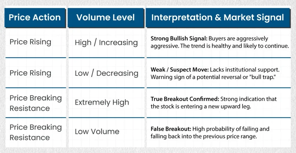
Reading Volume Signals to Validate Moves
Volume acts as a truth detector for price action. It tells you how much conviction or institutional financial backing is behind a price move.
5. Basic Technical Indicators to Spot Trading Signals
While reading raw price action and volume (price action trading) is essential, adding a few simple technical indicators can help filter out noise and generate clear entry or exit signals.
For examples:
Moving Averages (MA)
A Moving Average smoothes out sharp daily price fluctuations by calculating a continuously updated average price over a specific number of days.
- Simple Moving Average (SMA): Calculates the average price over a set period (e.g., 50 days or 200 days).
- Key Levels to Watch:
- 50-Day SMA: Popular medium-term trend line used by swing traders.
- 200-Day SMA: The major long-term benchmark used by institutional investors to judge overall market health.
- The Crossover Signals:
- Golden Cross (Bullish Signal): Occurs when a short-term moving average (like the 5-day or 20-day) crosses above a long-term moving average (like the 50-day or 200-day). It indicates momentum is turning strongly positive.
- Death Cross (Bearish Signal): Occurs when a short-term moving average crosses below a long-term moving average, signaling potential sustained downside pressure.
Relative Strength Index (RSI)
The Relative Strength Index (RSI) is a momentum oscillator measured on a scale from 0 to 100. It helps traders identify whether a stock is overbought or oversold relative to its recent price history.
- Overbought (> 70): Indicates that the stock has risen too far, too fast. The price may be due for a pullback or period of consolidation.
- Oversold (< 30): Indicates that selling pressure may be exhausted. The stock could be undervalued in the short term and primed for a relief bounce.
Warning:
Avoid cluttering your charts with dozens of indicators. Stick to two or three high-quality tools to prevent “Analysis Paralysis.”
Fibonacci Retracement
Fibonacci Retracement is one of the most widely used technical analysis tools among traders and investors. It is based on the idea that markets rarely move in a straight line; instead, after a strong trend (upward or downward), prices often “retrace” or pull back a portion of their move before continuing in the original direction.
Core Fibonacci Retracement Levels
When applied to a chart, the tool generates horizontal lines indicating potential area of *Support* (where prices stop falling) or *Resistance* (where prices stop rising):
| Level | Significance |
| 11.6% / 23.6% | Shallow Retracement: Indicates a very strong trend with minimal pushback. |
| 38.20% | Moderate Retracement: Common in healthy, ongoing trends. |
| 50.00% | Psychological Midpoint: A benchmark area where traders watch closely for reversals. |
| 61.80% | The Golden Level: Considered the most critical level; deep pullbacks often pivot here. |
| 73.6% / 100% | Deep Retracement: The last line of defense before a full trend reversal. |
How to Draw It on a Chart
To draw Fibonacci Retracements correctly, you need to identify a distinct Swing High and Swing Low.
- Uptrend (Looking to Buy the Dip)
- Select the Fibonacci Retracement tool on your charting platform.
- Click on the recent Swing Low (the start of the move).
- Drag the cursor to the Swing High (the peak).
Result:
Horizontal lines will appear below the peak, marking potential support levels where the price might bounce.
- Downtrend (Looking to Sell the Rally)
- Click on the recent Swing High (the top of the decline).
- Drag the cursor to the Swing Low (the bottom).
Result:
Horizontal lines will appear above the low, marking potential resistance levels where the bounce might stall out.
How Traders Use It in Practice
- Finding Entry Points: Traders wait for a price to pull back to a key level (e.g., 61.8%) and look for bullish/bearish confirmation signals (like candlestick patterns) to enter a trade.
- Setting Stop-Loss Orders: Stop-loss orders are often placed just below the next Fibonacci level (e.g., if buying at 50%, setting a stop-loss slightly below 61.8%).
- Price Targets: Fibonacci Extensions (levels beyond 100%, like 161.8%) are used to set profit targets once the trend resumes.
Tips & Limitations
- It’s a Self-Fulfilling Prophecy: Because millions of traders use these exact same levels, orders cluster around them, creating real support and resistance.
- Never Use It Alone: Combine Fibonacci levels with other indicators—such as moving averages, trendlines, trading volume, or candlestick reversal patterns—for confirmation (“confluence”).
- Subjectivity: Choosing which Swing High and Swing Low to connect can vary from trader to trader, leading to slightly different levels on different timeframes.
6. Three Common Mistakes Beginners Make When Reading Charts
Mastering how to read stock charts is as much about avoiding costly mistakes as it is about finding winning trades. Here are three major traps to avoid:
Mistake 1: Over-Complicating the Chart
It is easy to get caught up installing every technical indicator available—RSI, MACD, Bollinger Bands, Fibonacci Retracements, and Stochastic Oscillators. When your chart looks like a bowl of multi-colored spaghetti, you will experience Analysis Paralysis—a state where conflicting signals prevent you from making confident, timely trading decisions.
- Fix: Keep your trading charts minimalist. Master pure price action, volume, support/resistance, and one or two indicators.
Mistake 2: Trading Against the Macro Trend
Attempting to buy a stock that is in a steep, long-term downtrend simply because it experienced a single green day is a classic novice error (“catching a falling knife”).
- Fix: Always check the daily and weekly charts to ensure your short-term trade aligns with the overall macro market trend.
Mistake 3: Ignoring Volume on Breakouts
Entering a position on a stock as soon as it crosses a resistance line without checking volume frequently leads to losses. If big financial institutions are not buying into the move, the price will likely plummet right back down.
- Fix: Never trade a price breakout unless it is validated by significantly higher-than-average trading volume.
Conclusion & Next Steps
Reading a stock chart is not about predicting the future with 100% certainty—no indicator or pattern can guarantee that. Instead, chart analysis is about managing risk and putting the statistical probabilities of success in your favor.
By analyzing the horizontal and vertical axes, choosing candlestick views over simple line graphs, mapping out support and resistance lines, and verifying price moves with trading volume, you now possess the core toolkit to read any financial market graph with confidence.
Put Your Skills Into Practice Today:
- Open a free charting tool such as TradingView or Yahoo Finance.
- Type in a well-known ticker symbol (e.g., Apple – AAPL or Tesla – TSLA).
- Set your chart to the 1-Day Candlestick view.
- Identify whether the stock is currently in an Uptrend, Downtrend, or Consolidation phase.
- Draw one support line at the recent lowest bounce point and one resistance line at the recent highest ceiling.
Practice reading charts daily, and over time, interpreting market moves will become second nature!
Frequently Asked Questions (FAQ)
Is stock chart analysis accurate for predicting stock prices?
Stock chart analysis is not a magic crystal ball that guarantees predictions. Instead, it measures market probability and trader psychology. It helps traders manage risk, identify favorable risk-to-reward entry points, and exit losing trades quickly before major losses occur.
Which chart type is best for stock market beginners?
For absolute beginners looking for a simple trend overview, a line chart is the easiest to read. However, as soon as you begin actively trading, candlestick charts are recommended because they provide essential data regarding opening, closing, high, and low prices within a single visual element.
What is the best timeframe for reading stock charts?
The best timeframe depends entirely on your trading style. Long-term investors and position traders prefer daily and weekly charts to filter out noise. Swing traders focus primarily on 4-hour and daily charts, while day traders utilize intraday charts, such as the 5-minute or 15-minute timeframes.
Disclaimer:
This article is strictly for educational purposes and does not constitute financial or investment advice. Always conduct your own research or consult with a licensed financial advisor before making investment decisions.