Trend lines Trading: Definition, Drawing, Uses & Benefits
What Are Trend lines in Trading? A Simple Guide for Beginners
When you first look at a trading chart, all the price movements, such as the highs, the lows, and constant changes, can feel overwhelming. Trend lines in trading help to simplify this by showing a trader the overall direction a market is moving in. Whether you’re trading forex, stocks, or commodities, understanding trend lines is a key part of reading the market direction and spotting technical patterns.
Whether you’re trading forex, commodities, or stocks, learning how to use trend lines is a key part of mastering technical analysis.

What Is a Trendline?
A trendline is a straight line that connects a series of price points on a chart, either highs or lows, to reveal the market’s direction.
Think of it this way:
- If the price is generally rising (an uptrend), the trend line will slope upward.
- If the price is falling (a downtrend), the trend line slopes downward.
- If there’s little movement either way, it may appear flat or horizontal (a sideways market).
Knowing how to draw trendlines helps you understand market psychology and spot key zones of support and resistance. These lines don’t just make charts easier to read; they provide insights into momentum and possible turning points in the market.
Historical and Theoretical Background of Trendlines
The use of trendlines in trading dates back to the early 20th century and is rooted in the foundations of technical analysis. Charles Dow, through his Dow Theory, introduced the idea that markets move in trends. While he didn’t draw trendlines himself, his concepts inspired analysts to visually interpret market direction by connecting key price points, an approach that eventually evolved into the use of trendlines as traders commonly apply today.
At its core, a trendline reflects market psychology. When prices repeatedly react at certain levels, it signals collective behaviour, whether it’s confidence, hesitation, or a shift in supply and demand. By connecting swing highs or lows, trendlines help traders visualize these dynamics and identify support or resistance zones. Today, they remain a core element of technical analysis, used by traders and investors of all styles to understand and anticipate market movement.
Different Market Contexts for Trendlines: Forex, Stocks, Commodities, Cryptocurrency
Trendlines are a versatile tool used across all types of markets, but their interpretation can vary slightly depending on the asset class:
- Forex: In currency markets, trendlines help identify which direction a currency value is moving, especially during news-driven moves or central bank cycles. Traders often draw trendlines on major pairs like EUR/USD or USD/JPY to spot key points where prices might change direction.
- Stocks: For stock traders, the use of trendlines to understand investor sentiment and momentum. An upward trendline in bullish markets can signal strength, while a downward break may point to early reversal signals. These lines help traders identify significant shifts in market behaviour and make informed decisions.
- Commodities: Commodities like gold or oil respond heavily based on news about the economy and geopolitical events. Trendlines help traders navigate these swings by clarifying price channels and supply/demand levels. This makes it easier for them to decide when to buy or sell.
- Cryptocurrency: In the highly volatile world of cryptocurrencies, trendlines can highlight key support and resistance amid sharp price fluctuations. They’re especially useful for tracking trending markets like Bitcoin or Ethereum.
By understanding the context in which you’re trading, trendlines can be adapted to fit the behaviour and characteristics of each market.
Why Are Trendlines Important?
Trendlines help traders:
- Identify the market trend (up, down, or sideways)
- Highlight support and resistance levels
- Spot potential entry or exit points
- Predict when a trend may reverse or break down
While simple in design, trendlines are one of the most widely used tools in technical analysis. They work especially well when combined with other indicators like Simple Moving Averages or Moving Average Convergence/Divergence (MACD).
Trend Line-Specific Risk Management Strategies
While trendlines are a foundational tool in technical analysis, effective risk management is essential to avoid costly errors and false signals. The following strategies help traders apply trendlines with greater discipline and control:
Here are several practical ways trendlines can enhance your risk management:
I. Use Stop-Loss Orders Below/Above the Trendline
When entering a trade based on a trendline bounce or breakout, place a stop-loss just beyond the trendline.
- In an uptrend, place the stop-loss slightly below the trendline.
- In a downtrend, position it just above the trendline.
This approach limits downside risk in the event of a sudden reversal or failed trend continuation.
II. Avoid Over-Reliance on a Single Line
Trendlines are not infallible. Their strength diminishes when price action frequently pierces the line or when the line has been tested multiple times. Traders should monitor price behaviour closely and be prepared to redraw or reassess trendlines as market dynamics evolve.
III. Confirm with Volume and Technical Indicators
The reliability of a trendline setup improves when supported by other technical tools:
- Volume: Breakouts accompanied by higher volume are generally more convincing.
- Momentum indicators (e.g., RSI or MACD): These can help identify whether the market has the strength to sustain a move beyond the trendline.
Using these tools in conjunction with trendlines enhances the validity of trade entries.
IV. Maintain a Favourable Risk-Reward Ratio
Sound risk management includes only pursuing setups where the potential reward outweighs the risk, ideally by a ratio of 2:1 or greater. Traders should define:
- A clear entry point near the trendline
- A stop-loss level just beyond it
- A realistic take-profit target based on nearby support/resistance or measured move projections
V. Reassess Following Breakouts
A broken trendline does not always indicate a failed trend. Traders should wait for confirmation before reacting, such as:
- A retest of the trendline from the opposite side
- A decisive close beyond the line on higher timeframes
- Supporting evidence from volume or price structure
In the meantime, manage open trades accordingly. This may mean tightening your stop-loss or closing a portion of the position.
VI. Cross-Verify Using Multiple Timeframes
Trendlines that align across several timeframes such as the 1-hour, 4-hour and daily charts tend to carry more significance. Multi-timeframe validation helps filter out noise and increases the probability of reliable signals.
Using Trendlines with Other Indicators
To strengthen trading signals, many traders combine trendlines with technical indicators. This not only confirms trends but also reduces the chances of reacting to false breakouts.
Simple Moving Averages (SMA):
- What it does: An SMA shows the average price of an asset over a certain number of days (like 50 or 200). It smooths out price movement to help spot trends more easily.
- How it helps: If the price stays above a rising SMA (like the 50-day), it can be a sign that the market is in an uptrend especially if it also bounces off a trendline.
- Keep in mind: When a short-term SMA (like the 50-day) crosses above a long-term one (like the 200-day), it can signal the start of a new upward trend. This is called a “bullish crossover”.
MACD (Moving Average Convergence Divergence):
- What it does: MACD is a tool that shows both trend direction and momentum (how strong a trend is). It’s made up of two lines that move with price changes.
- How it helps: When the MACD lines cross upward (especially when the price is also bouncing off a rising trendline) it can be a strong sign the price may go higher (a bullish signal).
- Keep in mind: If the price is still going up, but the MACD is going down (called “bearish divergence”), it can warn that the uptrend is weakening and a reversal might be coming.
RSI (Relative Strength Index):
- What it does: RSI helps you see if a market is overbought (possibly too high) or oversold (possibly too low). It’s shown as a number between 0 and 100.
- How it helps: In an uptrend, if the price touches a trendline and RSI is near 30, the market may be oversold, which could point to a buying opportunity. In a downtrend, an RSI near 70 might suggest the market is overbought and due for a drop.
- Watch for divergence: If price keeps rising but RSI starts falling, it could be an early warning that the trend is losing strength and may reverse.
Fibonacci Retracement Levels:
- What it does: Fibonacci retracement levels highlight possible areas where price might pause or reverse during a trend. Common levels include 38.2%, 50%, and 61.8%.
- How it helps: When these levels line up with a trendline, it forms a strong “confluence zone.” This area can help traders plan entry points, set take-profit targets, or place stop-losses more confidently.
- Keep in mind: The more technical factors that align (like trendlines, Fibonacci levels, and candlestick patterns), the stronger the potential signal.
Multi-Timeframe Trendline Analysis
Multi-Timeframe Trendline Analysis is a trading method that uses charts from different timeframes, such as daily, hourly, or 15-minute charts to get a fuller picture of the market. Instead of focusing only on short-term or long-term price movements, you combine both. This helps you confirm trends, find better trade setups, and reduce the chance of falling for false breakouts.
Why Timeframes Matter
Markets move in waves. A trend that looks strong on a 15-minute chart might be part of a much larger trend (or even a pullback) on the daily chart. By checking multiple timeframes, you can:
- Understand the bigger picture (where the market is heading overall)
- Refine your entries using short-term charts
- Avoid trading against the dominant trend
Why Multi-Timeframe Trendlines Matter
Using trendlines on more than one timeframe helps you:
- Spot stronger and more reliable trends
- Avoid false breakouts or whipsaws
- Fine-tune your entry and exit points
How to Use Multi-Timeframe Analysis (Step-by-Step)
- Start with a higher timeframe (Daily or 4H):
- Look at the overall market direction to identify whether it is trending up, down, or sideways.
- Draw clear trendlines that the price has respected multiple times.
- These lines act as strong support (price bounces up) or resistance (price turns down).
Example: On the Daily chart, you might draw an upward-sloping line that touches several higher lows that showing ongoing buying pressure.
- Zoom into a lower timeframe (1H or 15M):
- Look for more recent trendlines based on short-term movements.
- Check how the price behaves around the major lines drawn from the higher timeframe.
- Use this view to time your entries, set stop-loss levels, or spot early breakouts.
Tip: If the lower timeframe confirms the same direction as the higher one, the setup is stronger.
- Align both timeframes before trading:
- If both timeframes show the same trend, you’re trading with the majority.
- If they disagree, it may signal indecision, consolidation, or an upcoming reversal, so it’s better to stay cautious.
What You Gain from Multi-Timeframe Analysis
- Stronger Confirmation:
A breakout that’s visible on both Daily and 1H charts is more likely to succeed. - Better Timing:
Zooming in lets you avoid entering too early or too late. - Clearer Context:
You won’t mistake a small move for a big trend or miss a reversal forming in the background.
Psychological and Market Sentiment Behind Trend Lines
Trendlines are more than technical tools, they’re visual maps of trader psychology. They help us understand what the crowd is feeling and where key decisions are likely to happen. Here’s how it works:
- Trendlines Show Confidence or Doubt
- In an uptrend, price makes higher lows and buyers step in earlier each time, pushing the price higher.
- This forms a rising trendline, acting like a floor.
- It shows confidence: traders expect prices to keep rising, so they buy sooner.
- In a downtrend, price makes lower highs and sellers are acting faster, expecting drops.
- This creates a falling trendline, like a ceiling holding the price down.
- It reflects fear or pessimism, traders want to sell before prices fall further.
Trendlines help reveal who is gaining control between buyers and sellers by reflecting real shifts in market sentiment.
- Why Repeated Touches Matter
Each time the price touches a trendline and respects it (bounces off instead of breaking through), it adds credibility to that line.
- Traders start to trust the line as a zone where the price is likely to react.
- As more traders rely on the trendline, their actions reinforce its significance, making it an even more reliable indicator.
Think of it like a trail in the forest: the more people walk it, the clearer and easier it is to follow.
- Breakouts Reflect a Change in Belief
When price breaks through a trendline, it often signals a shift in market sentiment:
- Breaking below an uptrend line → buyers may be losing strength or confidence.
- Breaking above a downtrend line → sellers are losing control, and buyers may take over.
These breakouts are often key turning points — they don’t guarantee a trend reversal, but they tell you something in the crowd has changed.
- Momentum and Strength Near Trendlines
- A strong bounce off a trendline (fast, sharp move) means buyers/sellers are reacting with confidence. Momentum is building.
- A weak or slow bounce might show hesitation, the trend is losing momentum.
Sometimes price “hugs” the trendline or moves sideways near it, which can signal a potential reversal or breakout setup.
- Practical Tip for Beginners
Always ask yourself:
- Is this trendline being respected?
- How strong is the price reaction around it?
- If it breaks, what does that say about how traders are feeling?
By reading these cues, you’re not just drawing lines, you’re learning to think like the market as well.
How to Draw a Trendline
Understanding how to draw trendlines correctly is crucial. Here’s how to get started:
- Uptrend: Connect at least two or three higher lows, points where the price dips briefly but then continues rising. This forms a support line.
- Downtrend: Connect at least two or three lower highs, points where the price rises temporarily before falling again. This forms a resistance line.
- Validation: The more points that touch the line without breaking through, the more reliable that trendline becomes.
Note: A trendline isn’t a rigid rule, it’s a guideline. Prices may test or break the line from time to time. When a trendline is broken, it can be a sign that the market is shifting.
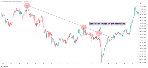
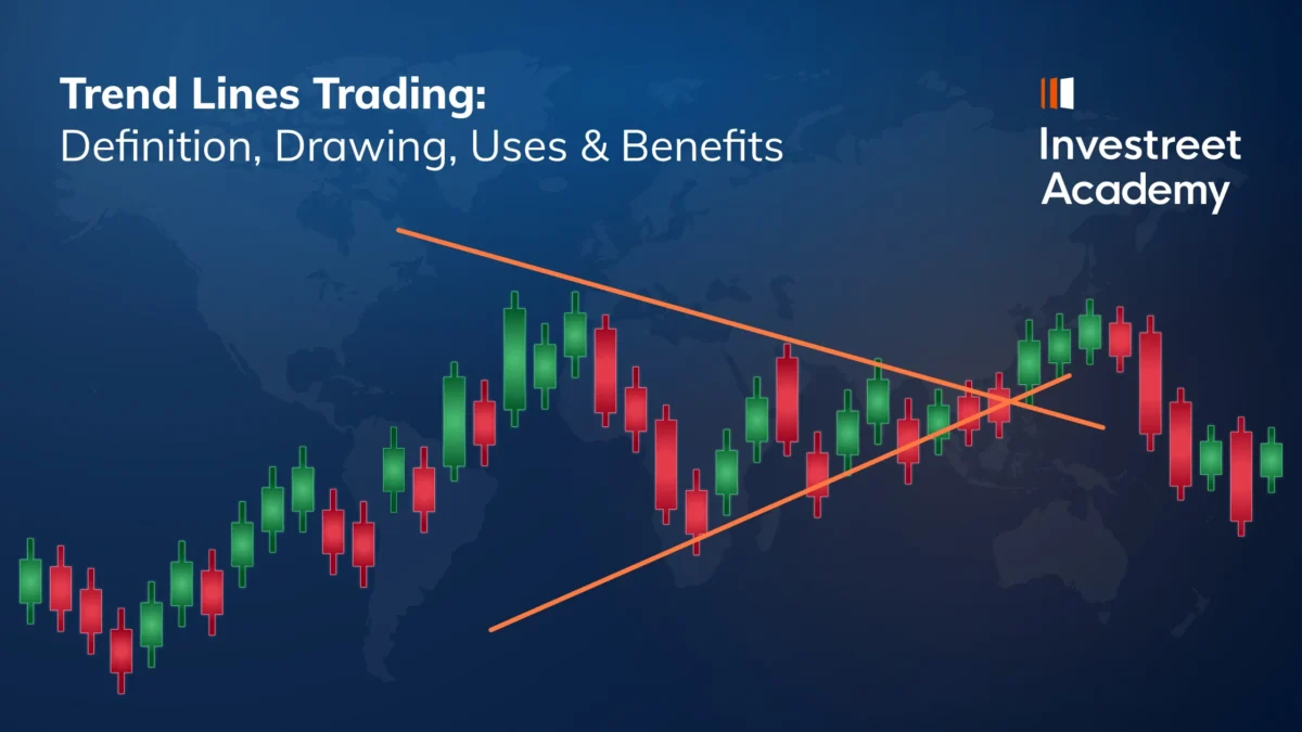
Figure 1: Downtrend showing a retest of the trendline before a selling opportunity
Handling False Breakouts and Trendline Failures
Even the best-drawn trendlines can break, but that doesn’t always mean the trend is finished. Sometimes the price briefly moves beyond the trendline, either above or below, and then quickly reverses direction. This is known as a false breakout, which can mislead traders into making premature decisions.

Figure 2: Example of a false breakout below trendline support, illustrating the need for confirmation.
What Is a False Breakout?
A false breakout happens when the price moves past a trendline briefly, only to snap back in the original direction. It might look like a trend is reversing, but it’s not. These moves can happen because of short-term volatility, stop-loss hunting, or sudden news events.
Example: Imagine you’re watching an uptrend where the price has bounced off the trendline three times. One day, the price dips slightly below the trendline, triggering fear of a breakdown. But within a few hours, it recovers and continues rising. That dip was a false breakout.
How to Spot and Handle False Breakouts
Here are a few ways to protect yourself from reacting too quickly:
- Wait for Confirmation
Don’t react the moment the price touches or breaks a trendline. Wait for a full candle to close clearly beyond it, ideally with strong volume or momentum. Quick wicks or spikes often lead to false breakouts, which tend to reverse soon after. - Use Volume as a Clue
When price breaks a trendline on low volume, it often signals weak interest, making a false breakout more likely. In contrast, a real breakout usually comes with a clear surge in volume, showing strong buying or selling and trader commitment. - Set Buffer Zones (Don’t Be Too Precise)
Price may dip just below or rise just above the line before continuing in the same direction. This doesn’t always mean the trend is broken, often it’s just a test of the area. Giving your trendlines a little buffer helps you avoid being misled by small, short-lived moves.
- Combine with Indicators
Use tools like RSI, MACD, or moving averages to confirm a breakout. If the trendline breaks but your indicators don’t agree, it might not be a strong signal.
- Practice Good Risk Management
Even with the best analysis, trendline failures can happen. That’s why it’s essential to set stop-loss orders and only risk a small portion of your capital on each trade.
When a Trend Line Truly Fails
If the price breaks a trendline with strong momentum and follow-through, it may signal that the trend is truly reversing.
Signs of a valid trendline failure include:
- A clear candle is close to well beyond the line
- Increased volume during the break
- Lower highs forming after an uptrend line is broken (or higher lows after a downtrend line break)
- A shift in market structure, such as support turning into resistance
When this happens, it’s time to either re-evaluate your trade, redraw your trendline, or even consider trading in the opposite direction.
Figure 3: Strong breakout above the trendline followed by a retest, indicating a valid entry point.
Tip: False breakouts and trendline failures are a natural part of trading. The key is not to avoid them entirely but to recognize them quickly and adjust smartly. Stay patient, use confirmation tools, and keep your emotions in check.
Common Mistakes When Drawing Trendlines
Even though trendlines are simple, beginners often make a few common mistakes that can lead to wrong signals. Here’s what to watch out for:
- Forcing the Line to Fit
Don’t bend or force a trendline to touch more points just to make it “look right”. A valid trendline should naturally connect at least two or three clear swing highs or lows. - Ignoring Timeframes
A trendline on a 5-minute chart might look totally different from one on a daily chart. Make sure you’re drawing trendlines on the right timeframe for your strategy. - Drawing from Random Points
Trendlines should connect significant swing highs and swing lows, not just any tiny bumps in price. Use the most obvious points where price has clearly reversed. - Not Adjusting When Market Changes
Trendlines can break or become outdated as markets evolve. If price breaks through a trendline and doesn’t return, redraw it and don’t keep using the old one. - Ignoring Confirmation
One line isn’t enough, always combine trendlines with other tools, like volume, indicators, or candlestick patterns, to confirm your analysis.
Dynamic vs. Static Trendlines: Adjusting Trendlines as the Market Changes
Trendlines are not permanent, they can change as the market changes.
When you first draw a trendline, it may work for a while. But markets are always moving, and over time, that original line might no longer match the new price action. In that case, it’s okay (and often helpful) to update or redraw the line. This is where two different styles come in: Static and Dynamic trendlines.
Static Trend Lines (Set and Forget)
A static trend line is one you draw once and leave it alone. It’s based on the most obvious highs or lows and used as a consistent reference point. Think of it like drawing a straight road on your map — even if traffic changes, the road itself stays the same.
- Best for: Bigger-picture trends, long-term charts
- Good because: It’s clean, easy to see, and useful for historical comparison
- Watch out: It can become outdated if the market shifts too much
Dynamic Trend Lines (Update as You Go)
A dynamic trend line gets adjusted over time. As the market makes new highs or lows, you update your line to match what’s happening now. It’s like tuning a musical instrument, as the market shifts, you make small adjustments to stay in harmony with the latest price action.
- Best for: Fast-moving markets, shorter timeframes
- Good because: It gives you a more current view of market direction
- Watch out: Changing it too often can be confusing and lead to “chasing” the market
Which One Should You Use?
There’s no one “right” way. What matters is using the method that fits your style:
- If you’re trading longer trends (like over several days or weeks), static lines can give you clear structure.
- If you’re trading short-term moves (like intraday or scalping), dynamic lines can help you keep up with quick changes.
Whichever method you choose, use clear, obvious price points (not random ones), and stay consistent with how you draw and adjust your trendlines.
Visual Examples
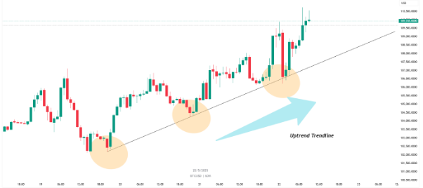
Figure 4: Uptrend line showing higher lows acting as support.
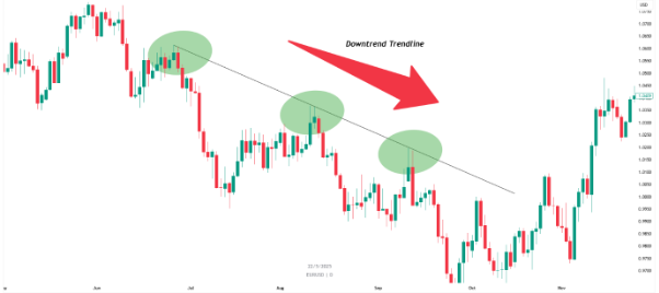
Figure 5: Downtrend line connecting lower highs acting as resistance.
A Quick Example
Let’s say the price of gold has been climbing steadily. You can draw a trend line below the rising lows, this acts as a support line. As long as the price stays above it, the uptrend is likely to continue. But if it breaks below that line, it could signal a potential reversal or weakening trend.
This simple method of trendline analysis helps traders anticipate the next move, without relying on guesswork.
Final Thoughts on Trendlines
Trendlines in trading are a beginner’s best friend. They make it easier to understand market trends, highlight areas of support and resistance, and sharpen your overall technical analysis.
But remember, no single tool is perfect. A trendline is a guide, not a guarantee. Always combine trendline analysis with other indicators like SMA or MACD and stick to sound risk management in your trading strategy.
Case Studies of Trades Using Trendlines
- Forex: GBP/USD Uptrend and Breakout
Chart used: 4-hour chart (each candle shows 4 hours of price movement)
Market condition: Uptrend with clean pullbacks
Trade idea: Buy when the price bounces off the trendline, exit if it breaks
Scenario:
A trader notices that the GBP/USD currency pair has been rising for two weeks. The price keeps making higher lows, meaning each dip is a bit higher than the last one. The trader draws a rising line underneath these dips, called a trendline.
Each time the price touches the line, it bounces back up. On the third bounce, the trader decides to buy (go long), and puts a stop-loss just below the trendline, this protects them if the trend fails.
A few days later, the price drops below the trendline with strong momentum and higher trading volume. This could mean the uptrend is ending. The trader closes the trade to avoid losses and waits for a new setup.
Lesson: Trend lines can act like support, a kind of “floor” for the price. But if price breaks through that floor, it may mean the trend is changing direction.
- Stock: Tesla (TSLA) Trend Reversal from Downtrend
Chart used: Daily chart (each candle shows one day)
Market condition: Long-term downtrend, breakout triggers reversal
Trade idea: Buy after the price breaks above a downtrend line
Scenario:
Tesla stock has been falling for over a month. The trader draws a downward trendline across the lower highs; each time the price tries to rise, it stops lower than before. This trendline acts as resistance.
One day, Tesla’s price moves above the trendline with a strong green candle and higher-than-normal trading volume, a possible breakout. The trader checks two indicators for confirmation:
- MACD shows a bullish crossover (a sign momentum is turning up)
- RSI is rising (showing increasing strength)
The next day, the trader buys the stock and puts a stop-loss just below the breakout point.
Lesson: When price breaks above a downtrend line and other indicators confirm the move, it can be a sign of a new upward trend starting.
- Crypto: Bitcoin (BTC/USD) Using Multi-Timeframe Trendlines
Charts used: Daily chart and 1-hour chart
Market condition: Strong uptrend
Trade idea: Use a smaller chart to find better timing within a bigger trend
Scenario:
On the daily chart, Bitcoin is in a clear uptrend, with the price consistently making higher lows. The trader draws a rising trend line to illustrate long-term strength.
Then they look at the 1-hour chart (each candle shows one hour). Here, they spot a short-term trendline showing a small pullback within the bigger uptrend. Price is moving down slightly, but still above both trendlines.
Since both the daily and 1-hour charts show upward trends, the trader decides to buy near the 1-hour trendline. They also notice something called RSI divergence, where the price is making slightly lower lows, but the RSI is making higher lows. This could indicate that a bounce is coming.
The trader enters the trade and places a stop-loss just below the short-term trendline.
Lesson: Using trendlines on both large and small timeframes helps traders find better entry points. It also adds more confidence when both timeframes show the same trend direction.
Going Beyond the Basics: Understanding Trader Behaviour and Advanced Uses
Learning how to draw and use trend lines is a key skill, but as you grow as a trader, it’s important to go beyond just the basics. A big part of improving is understanding how traders behave around trendlines and how you can use that knowledge to your advantage.
Markets aren’t driven by charts alone. Trader emotions like fear, confidence, and hesitation often show up around key trendline levels. These lines act like psychological markers, and paying attention to how the price reacts around them can help you better predict what might happen next.
As you gain more experience, you might want to explore:
- Combining trend lines with other tools like support and resistance, Fibonacci levels, or moving averages
- Spotting false breakouts versus real trend reversals
- Using trend channels or curved/dynamic trendlines for more complex patterns
- Analysing multiple timeframes to see how short- and long-term trends align
Studying these advanced topics will help you move from just drawing lines to understanding how the market really moves and why. That’s what trading is all about.