Technical analysis is a method for forecasting the potential direction of price movements in any financial security, such as a stock, currency pair, or commodity, based on market data. It helps traders make the right decision about when is the best time to sell or buy the underlying asset at the right price direction.
In this article, we will explore technical analysis in more detail, starting with what it is, the details of its tools and concepts, and how to apply technical analysis to different financial instruments with different timeframes, while displaying trading strategies.
What is technical analysis?
Technical analysis is utilized to use past data and current price action to predict future price action. Price action is identified on price charts, which show signals and patterns that indicate price movement due to market psychology.
Technical analysts contend that price discounts all information, meaning the price action of all market participants reflects all available information, including economic data, news, and investor emotion. This is why technical analysis focuses on identifying price action to make trading decisions.
Price action tends to happen in a trend, and trends tend to repeat themselves. Technical analysis aims to identify price trends in an uptrend, downtrend, or sideways. These trends are discussed briefly below.
Technical analysis aids in identifying when to enter the market and when to exit a trade; this could be a long or short trade. Technical analysis is very different from fundamental analysis because fundamental analysis analyzes the fundamental strength of the underlying asset and focuses on the macro growth of the economy in the long term.
Key Tools and Concepts in Technical Analysis:
5 key tools can be used for technical analysis. These tools help the trader read the charts and interpret the price movements to predict the future direction of the underlying financial instrument. Combining these tools can give the trader the complete picture of the traded instrument.
- Price Charts:
Price charts display the price of a particular market over a while, and there are different time frames you can change between on any charting platform. The time for chart frames ranges from 1-minute charts to daily, monthly, or even yearly charts.
There are 3 main types of charts: line, bar, and candlestick. Let’s illustrate each type briefly:
Line chart
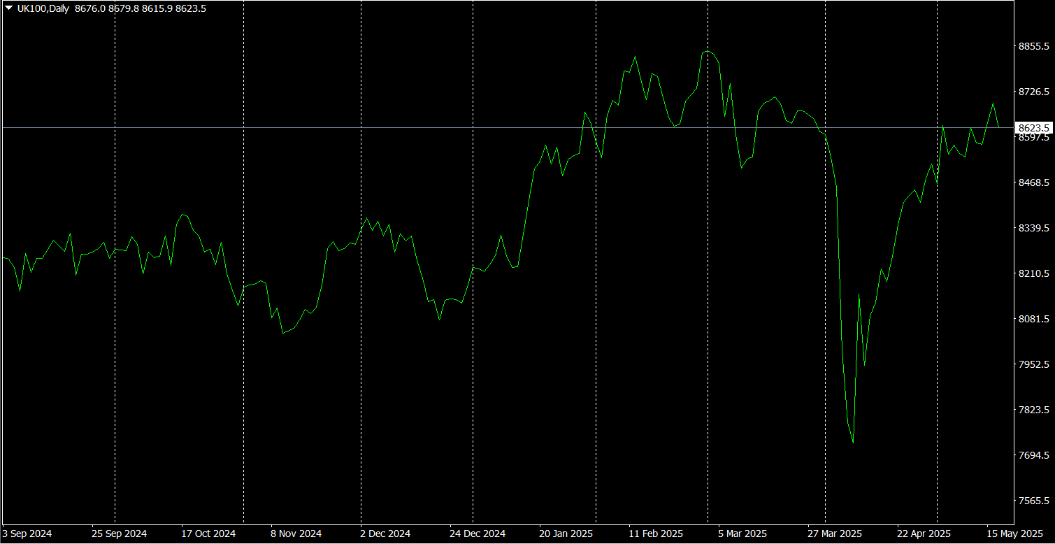
The line chart represents asset price movements over time by connecting a series of data points with a line. The line moved from one closing price to the next closing price. It’s the simplest form of charts used in the financial markets, as it’s easy to represent the general price movement of the market over a specific period. The line chart can be used for all time frames on the trading platform. Due to its simplicity, beginners often prefer it.
Bar Chart (OHLC Chart):
The bar chart is also called an OHLC chart because it provides 4 pieces of data for each specific period: the open, high, low, and close. The opening price is represented by the horizontal line on the left side and the closing price on the right side, while the vertical line within the bar defines highs and lows. So, on one bar, you can indicate where the price started and ended, adding to its price range.
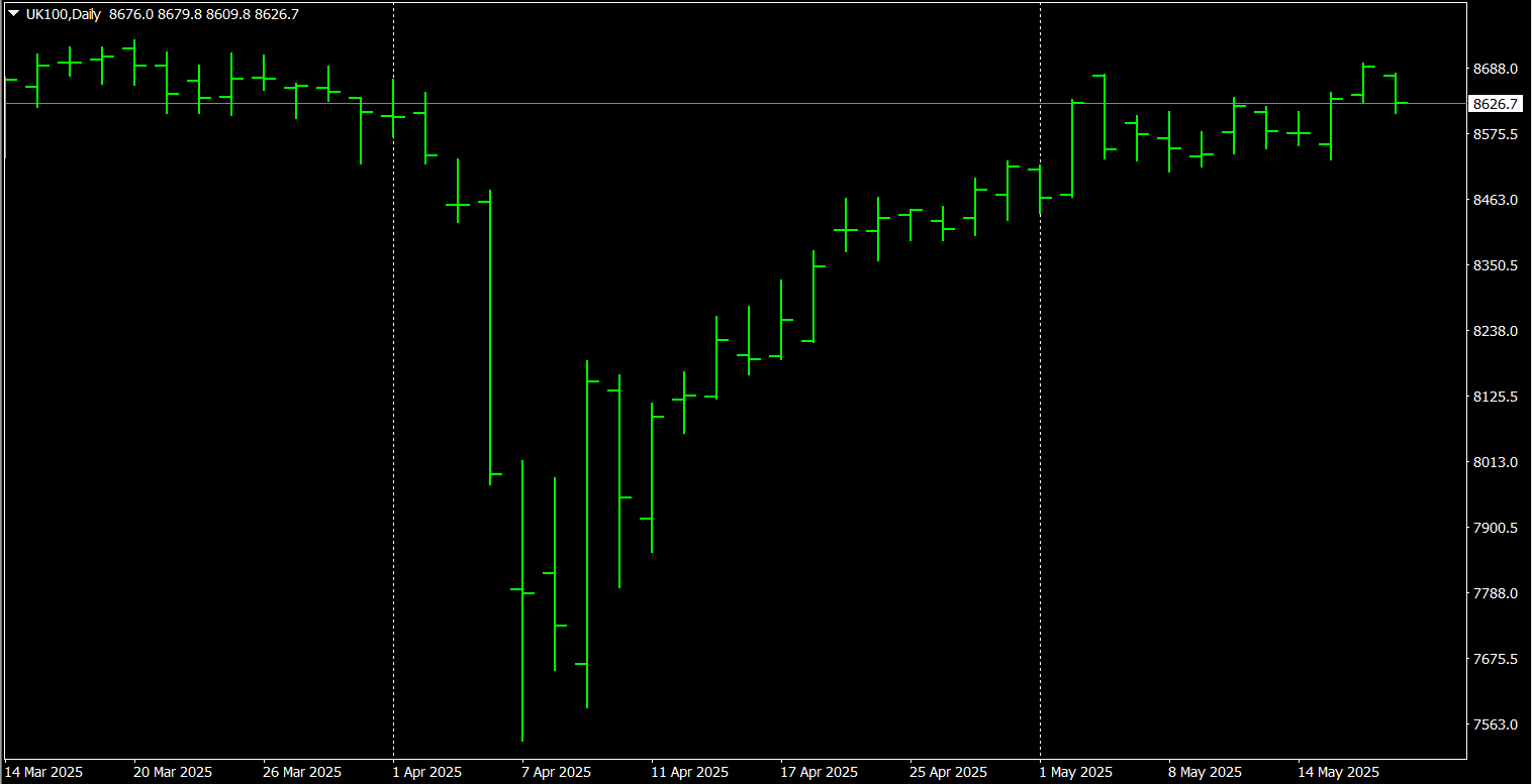
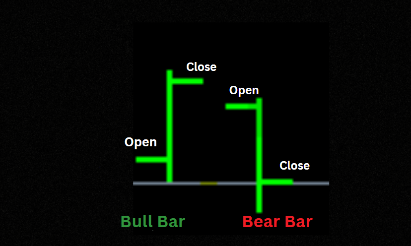
The chart can represent two types of bars, a bull bar or a bear bar, which show the relationship between the opening and closing prices within a specific period. Such as a bull bar or a bear bar.
The bull bars are when the open price is located at the bottom end of the bar, and the close is near the high so it’s (rising), while the opposite indicates to the (falling) bars because the open price will be located in the top of the bar and the closing price will be near the low price. As shown below:
Candlestick Chart:
This chart type consists of candlesticks instead of traditional price bars, as discussed above. Each candlestick reflects the price high, low, open, and close for a specific period, as well as reflected in traditional price bars. Still, candlesticks are easier to visualize and read the price behavior.
Candlestick charts represent the high and low of the specific period with a vertical line, as bar charts do. The top of the vertical is called the upper shadow, while the bottom is called the lower shadow; sometimes they are called “wicks” or “tails”. The rectangular part of the candlestick in the middle is called the real body.

2. Trends:
A trend reflects the direction in which the market is moving. There are three directions in which the market can go: uptrend (bull run), downwards (bear run), and sideways (rangebound). It’s crucial to learn how to identify trends to trade successfully. Trends usually come in three main types: Major, Intermediate, and Minor.
Major trends( primary):
This describes the whole market direction over a long period, from months to years.
Intermediate Trends (secondary):
This occurs within the major trend when the market changes direction over a shorter time.
Minor Trends:
This trend occurs over a very short period, less than one day.
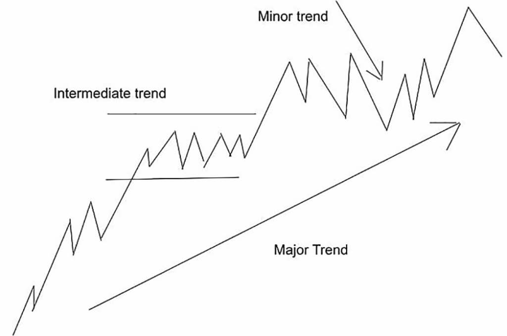
For clarification, if the market rallied over 10 months, it represents its major uptrend. Within that bull run, the market may become rangebound for weeks or months before resuming its major trend. This is what we call an intermediate trend. And for a given day, we called it a minor bull or bear run.
How to Draw Trendlines
General trendlines are one of the most used techniques in technical analysis in the foreign exchange markets. However, they are often not used correctly, which makes them unrelated to the right indication. It’s very important to draw the trendline correctly to give you the right information.
To draw the trendlines properly, you need to draw a line between the two main peaks through which the resistance line will be formed and mark the two main troughs through which the support line can be formed. While trading forex, you will face three different directions that usually happen in the market, such as a descending Direction, when the market is going from higher prices to lower prices, an ascending direction, when the market is going from lower to higher prices, and a sideways direction is when the market is trading in narrow range with no clear direction.
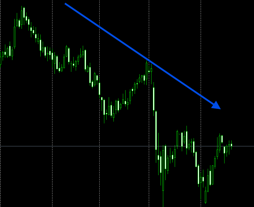
Descending Direction
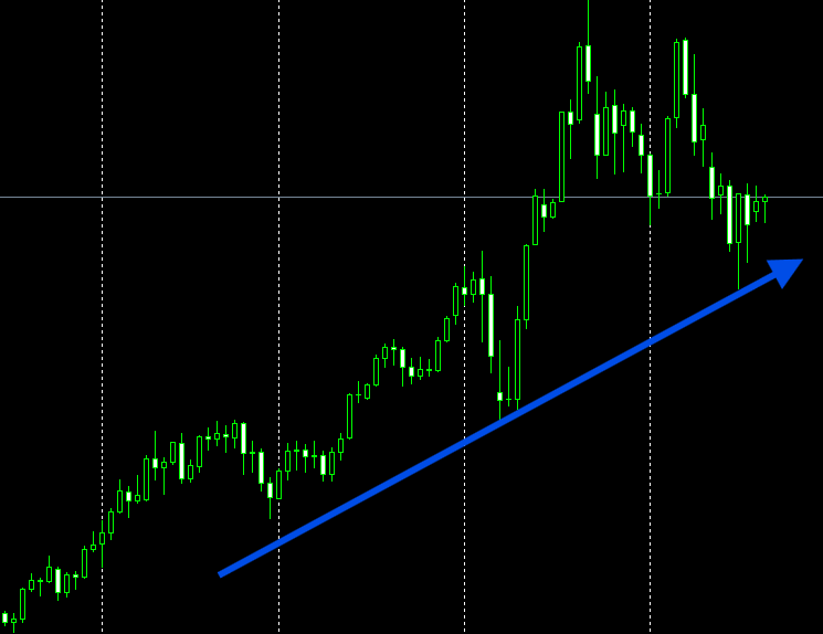
Ascending Direction
Sideways Direction
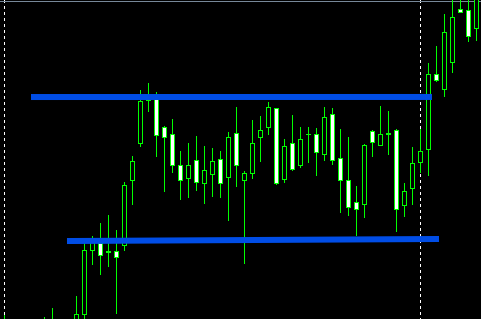
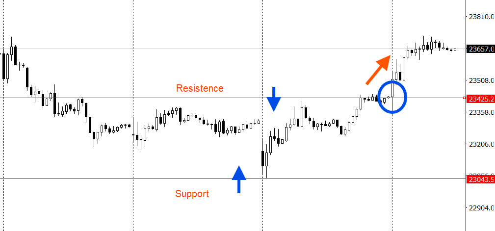
3. What is Support and resistance?
Support and resistance levels are horizontal price levels that typically draw on the trading chart for technical analysis. The support level is drawn horizontally from lows to lows, while the resistance level is drawn from highs to highs.
The support level is at which the downtrend is expected to pause due to the concentration of demand, the strengthening of buying power, and pushing the prices up; that is why we call it the support level.
The resistance level is at which the uptrend is expected to pause due to the concentration of supply and the strengthening of selling power, which will bring prices down; that’s why we call it the resistance level.
The chart below illustrates how the support and resistance levels typically function; however, as shown in the picture below, sometimes the resistance level may convert to act as support. This happens when the downtrend pauses and buying demand increases at the former level of the resistance. Then, this level is converted to support the price, so the price moves higher.
4. Understanding Volume:
Volume is the total number of shares or contracts traded during a specific period. Traders can benefit from using volume to assess the strength of price movements beyond significant support or resistance. The market’s activity and liquidity are measured by volume during a specific period. Additionally, higher trading volumes are more positive than lower ones because the market has better liquidity and better order execution.
During breakouts, volume conveys the validity of price movements. The breakout is when the price of the underlying asset moves through a resistance or support level, giving you the signal that indicates a potential trend reversal or continuation. Hence, the successful breakout comes from volume.
An example of how traders or investors can benefit from the volume in the context of breakouts:
- In case of High volume: when the breakout happened, combined with a significant increase in volume, this indicated strong market interest and the likelihood of a price move. This breakout, accompanied by high volume, suggests the trend will continue, reflecting strong buying or selling pressure.
- In case of low volume: if the breakout happened with low volume, this could be a false breakout (fakeout), which means that the price might reverse or consolidate and lose its breakout momentum.
5. Basic Indicators:
The indicators are statistics based on a security’s price, volume, or open interest. They measure the current market conditions for the foreign exchange market and predict future market movements. These indicators are mostly used for technical analysis to predict potential fluctuations from which you can profit.
Many indicators include the Moving Average, Bollinger Bands, stochastic, Parabolic SAR, and Relative Strength Index(RSI).
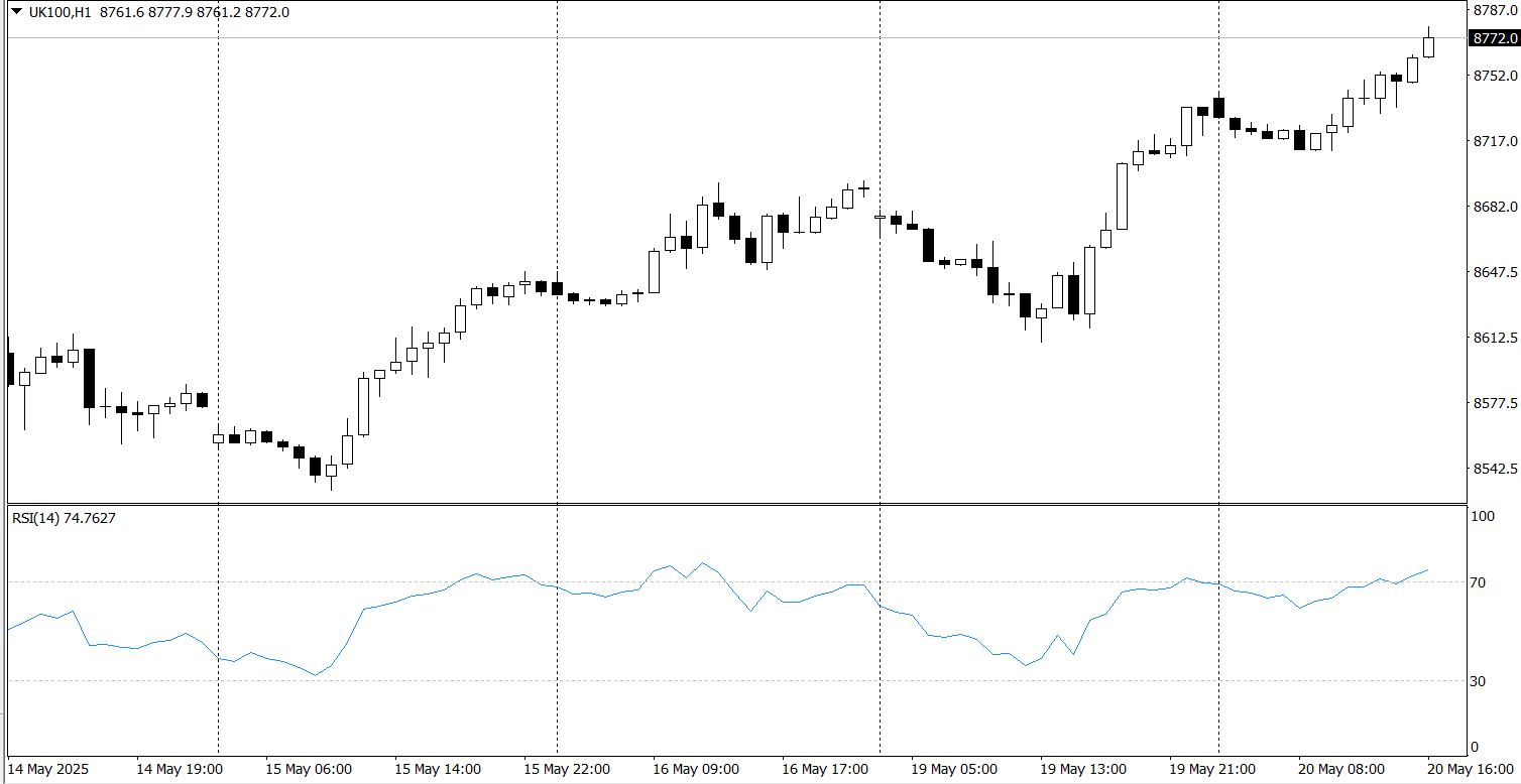
What is the Relative Strength Index indicator (RSI)?
The relative strength index (RSI) indicator helps traders identify whether a traded financial instrument has selling or buying momentum. Operating on a scale from zero to 100, a reading above 70 typically indicates buying momentum, while a reading below 30 suggests selling momentum. Therefore, the RSI indicator can be used to identify the main market trend.
So if you’re anticipating an uptrend market, the RSI should be above 50. And if you’re anticipating a downtrend market, the RSI should be below 50.
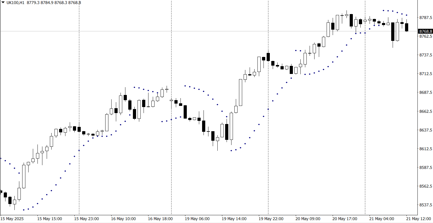
What is the Parabolic SAR?
The Parabolic SAR indicator is pointing to the end of the main market trend instead of the start. This is very useful for traders to know when they have to exit their positions, since the indicator places its marks on the trading chart, suggesting that a trend reversal might happen at this point. If the indicator’s dots are below the candlesticks, this indicates a buying signal. Conversely, it means a selling signal if it comes above the candlesticks.
Parabolic SAR performs better when the market is in an uptrend or a downtrend. It is worth noting that traders should be cautious or avoid using Parabolic SAR in a sideways market.
Key Common Chart Patterns:
Once you’re trading in the foreign exchange market, it’s essential to learn how to interpret and anticipate the main fluctuations. Doing so can help you gain more profit from trading. Therefore, to be able to do that, you need first to be able to read the trading chart patterns, which help you to predict when the market will fall, and when the trend reversal might happen. There are different chart patterns, divided into reversal patterns and continuation patterns.
Reversal Patterns:
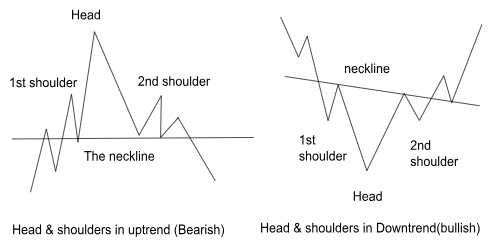
- Head & Shoulders:
This type of pattern results from a reversal formed by a smaller peak (Shoulder), followed by a higher peak (Head), and then another smaller peak (shoulder). You can draw a line connecting the lowest points; this line is called the neckline. The downward slope of the neckline is pointing to a potential trend reversal, so you can place a sell position below this neckline to take advantage before the price begins to fall.
There is also an inverse head and shoulders reversal pattern, which is the exact opposite of the one mentioned above; in this case, you can place an entry position above the neckline to take advantage before the price goes up.
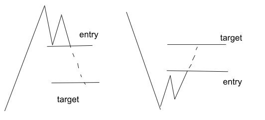
2. Double Top/Bottom:
There are two types of double patterns, the first being the Double Top pattern. This pattern happens after forming an extended upward movement. The price forms peaks on the trading chart until reaching a price level, at which it can not break through. The price will reverse downward from this level, attempting again to continue to go up.
At this time, the double top will be formed, but the second top will not be as high as the first one. The double top is considered a signal for potential trend reversal because the buying power is over. The double top usually happened after a significant uptrend movement.
The second is Double Bottom, the opposite of the abovementioned pattern. The double bottom will be formed in a significant downtrend movement, which means that the price will form two continued troughs, because it reaches a level that can not be broken through. The second trough will not be lower than the first, indicating that the selling pressure is over, and the price will reverse and go up.
3.Wedges
There are two types of wedges: rising and falling wedges. This pattern refers to investors who are unsure about the direction of the traded pair. The first is rising wedges, which happen when the price continues trading between support and resistance lines, especially when the support line’s slope is steeper than the resistance level. This indicates that the higher troughs form faster than the higher peaks. The rising wedges within the uptrend will potentially lead to a downtrend.
The second is the falling wedges, which are the opposite. This pattern signals a potential trend reversal or continuation in the same direction. If the falling pattern forms after a downtrend, this could lead to an uptrend. On the other hand, if it happens within an uptrend, this would let the price continue in the same direction.
Continuation Patterns:
This pattern suggests a continuation of the prevailing trend after a brief pause. Instead of signaling a reversal, they indicate that the price will continue in its original direction after consolidation.
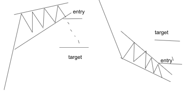
1. Flags:
Flag patterns are continuation patterns that form after a significant movement. This could be a strong uptrend or downtrend, which means buying or selling pressure, that allows the price to consolidate before continuing its original trend. At this time, a symmetrical triangle will be created on the trading chart. We call it a Flag, and this flag represents the consolidation period of the price.
During the consolidation period, more buyers or sellers (depending on the trend) will force the price to return to its original direction. The falling flags form during a significant downtrend movement, while the rising flags form during a significant uptrend.
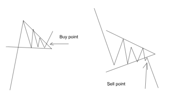
2. Triangles:
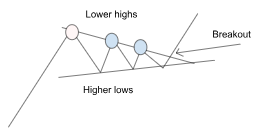
Triangle patterns include three different shapes in trading. The first one is the Symmetrical Triangle, when the slope of the peaks meets the slope of the troughs at a certain point. This means that the market creates lower highs and higher lows over time. When the troughs and peaks are close to each other, this indicates that the potential breakout is about to happen.
Even if unsure of the breakout’s direction, you can place the entry order above the peak’s slope and another below the trough.
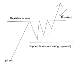
The Ascending triangle forms when the top line(resistance level) is flat horizontally due to the price trying to break out the resistance level at almost the same high point, and the bottom line is sloping upwards because the buying power keeps the price going up, so the price creates higher lows. This ascending triangle is a sign that the price will likely go up if the buyers push the price firmly above the flat top line. That flat top line, which used to stop the price from going up, will act as a support level after the breakout happens.
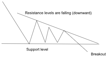
The Descending triangle is the opposite of the ascending triangle because the peaks’ sloping line and the support level connect at a certain point. This means that there is a price level at which the seller can not break through, but they are pushing the price downward. At this point, lower highs will be created on the trading chart to let the top line meet the support line at a certain point, forming the descending triangle.
This indicates that the breakout is likely to happen. Even if you don’t know the price’s direction, you can place two entry positions above the peaks (resistance level) and another below the troughs (support level).
The Bottom line:
Technical analysis requires practicing and keeping your eyes on the chart to be familiar with the movements and patterns. You can create your trading strategy by using any of the trading tools mentioned in this article, including the patterns and technical indicators. But it’s important to know that the market is fundamentally unpredictable, so we use these trading tools and patterns to ensure that we are only taking the right positions.