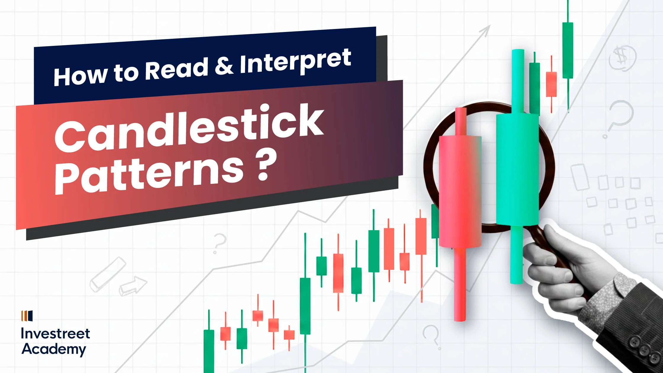
In this article we will learn about how to read the10 major candlestick patterns and how to interpret it, the candlestick charts might look like a bunch of squiggly lines and colorful rectangles at first, but once you get the hang on them, they’re more like your (BFF) best friend forever who always knows when things are about to go up or down. Now grab your coffee (or your favorite drink or snack), because we’re about to make candlestick chart reading easy and fun. So, let’s make a great move and dive into the world of trading and learn the few most major candlestick patterns!
What are Candlestick Patterns?
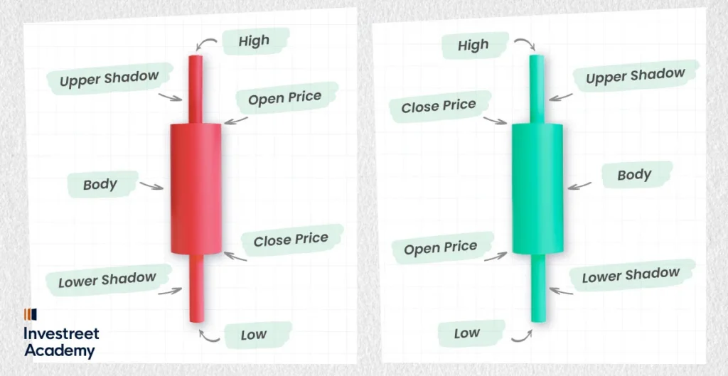
At its simplest, a candlestick chart is a visual representation of price movements over a set period. Each candlestick consists of a “body”, two “wicks” (or “shadows”) and two “colors”.
- The body tells you if the price went up or down within a specific time frame.
- The wicks? Well, they show the highest and lowest price reached during that time.
- The colour of the body is key: a green (or white) candlestick means the price has gone up, while a red (or black) candlestick indicates the price has gone down. Think of it like the market’s mood, green for bullish, red for bearish.
Candlestick patterns are like the market’s little mood indicators, they show you when things might be trending up, down, or about to change direction. Traders can use them to interpret market sentiment and get a sense of where prices might head next. Whether traders are riding a trend or looking out for a potential turning point, Recognize patterns, like the Bullish Engulfing or a Doji, these patterns will help traders make smarter, more informed trading decisions.
A Little History Lesson: Who Invented Candlestick Patterns?
Let’s take a time-travel detour, shall we? The use of candlestick patterns dates back to the 17th century, and it wasn’t some Wall Street whiz who came up with them. The credit goes to a Japanese rice trader named Munehisa Homma, who lived in the city of Sakata. While trading rice futures (yes, rice! Not exactly Bitcoin or gold), he discovered that price movements followed certain patterns, which helped him make more successful trades. Homma is often called the father of candlestick charting. So next time you glance at a chart, tip your hat to Munehisa for his market genius!
How Do You Read Candlestick Patterns?
After we have covered the history and fundamentals of candlestick patterns, let’s move on to how to interpret them and apply them to spot market trends. Candlestick patterns allow you to see the sentiment of the market and determine whether the bears or the bulls are in charge. They function similarly to a trader’s cheat map for comprehending price fluctuations.
But here’s the thing: every candlestick pattern has a unique role, and some are more suited to identifying particular trends than others. Let’s begin to explore how to interpret these patterns, and which ones are most useful for spotting market trends? We’ll discuss the most important ones that provide you with the best indication of the potential direction of the market.
- The Bullish Engulfing Pattern
The stock market is like a game of tug of war. When the (buyers) bulls take control, they often do so in a big way, and that’s what the bullish engulfing pattern is all about. It is formed by 2 candlestick, it happens when a small red (down) candlestick is completely engulfed by a larger green (up) candlestick. This suggests that the bulls are taking over and could drive prices higher.
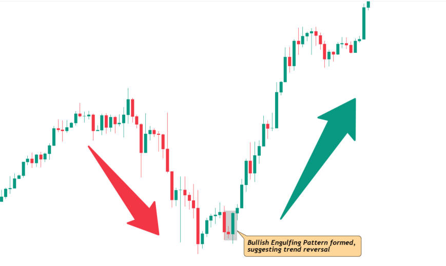
Best For:
Stock Market, Forex, Cryptocurrency (especially when prices are near a low point, suggesting a reversal to the upside).
- The Bearish Engulfing Pattern
This is basically the opposite of the bullish engulfing. Picture this: you’re just enjoying a sunny day, and out of nowhere, dark clouds roll in. It’s formed when a larger red candle engulfs a smaller green one, it signals that bears (sellers) are in control. This often means the price might start heading south.
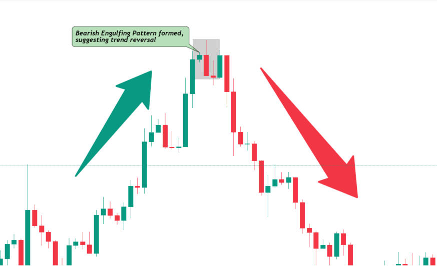
Best For:
Stock Market, Forex, Cryptocurrency (especially after an uptrend, suggesting a potential reversal to the downside).
- Doji: The “Meh” Candlestick
Ah, the Doji. This little guy looks like a cross or plus sign, and it signifies indecision. It’s the “I don’t know what to do” of candlesticks. When a Doji appears, it indicates the market is in a state of balance, with traders uncertain whether to push prices up or down. Think of it as the trading world’s version of standing at a crossroads.
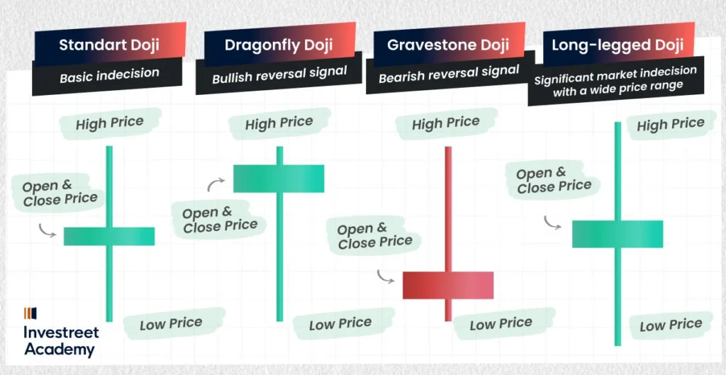
Best For:
Stock Market, Forex, Cryptocurrency (indicates indecision in the market, best used when paired with other indicators or trends).
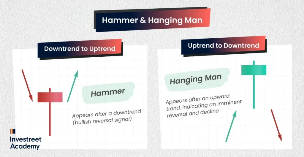
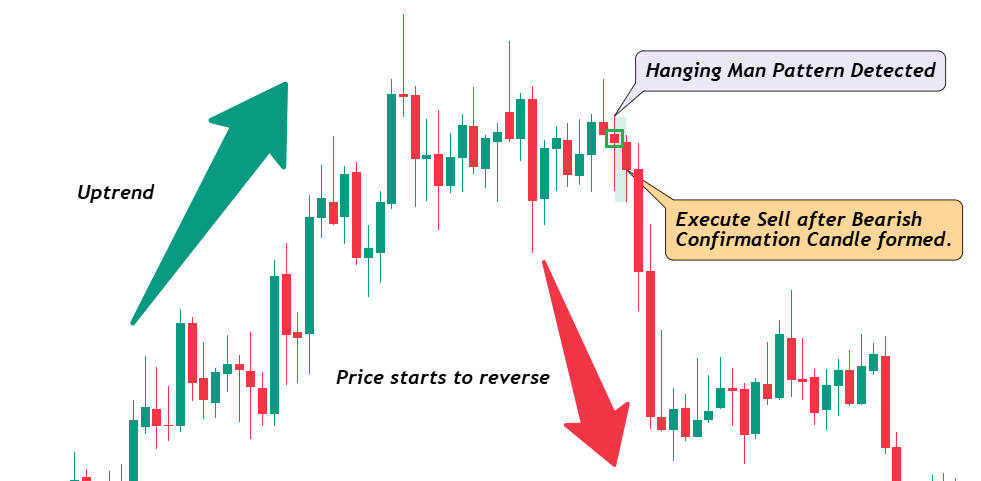
- Hammer and Hanging Man: The Twin Sisters of Reversal
The hammer and hanging man have nearly the same appearance, with a long lower wick and a small body at the top. Their positions are the main distinction. The hammer appears following a downward trend, indicating a possible reversal (bullish).
Conversely, the hanging man follows an upward trend and suggests that a bearish reversal may be imminent. They are similar to two sides of the same coin, but in order to determine which one you are dealing with, you must observe what occurs before and after.
Best For:
Stock Market, Commodities, Forex (especially when prices are near the end of a trend, signaling potential reversal).
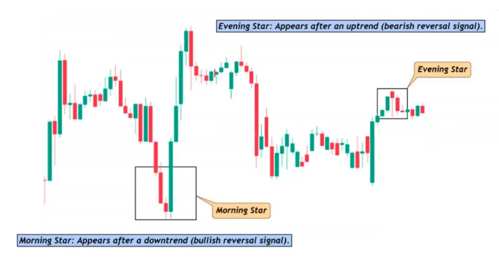
- The Morning Star and Evening Star: The Market’s Wake-Up Call
Just like the sun rises and sets, these two patterns signify a potential shift in market sentiment. The morning star (a three-candlestick pattern) suggests a reversal from a downtrend to an uptrend, while the evening star indicates the opposite. If you spot one of these, it’s like the market is saying, “Wake up! Things are about to change.”
Best For:
Stock Market, Forex, Commodities (perfect for identifying major reversals after a strong trend).
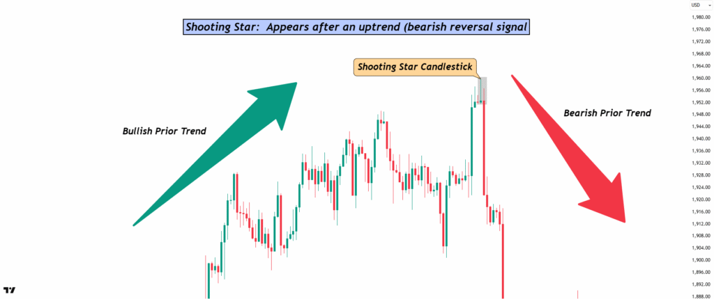
- The Shooting Star: The “Uh-Oh” Moment
Imagine you’re at a party and someone suddenly stands up, makes a big scene, and then leaves without saying a word. That’s the shooting star. It appears after an uptrend, characterised by a small body at the bottom and a long upper wick. It shows that the market tried to go higher but failed to sustain the upward momentum. The result? A potential reversal, where the price may soon begin to decline. A shooting star’s message is pretty clear: “Hold on, things might be about to change!”
Best For:
Stock Market, Forex, Crypto (usually signals a reversal after a strong uptrend).
- The Inverted Hammer: The Optimist’s Hammer
An inverted hammer looks almost identical to the shooting star but with a slight difference in its placement. It appears after a downtrend and signals a potential bullish reversal. Just like the hammer, it has a small body at the bottom and a long upper wick. What makes it “inverted” is the fact that it follows a decline. It shows that, even though the market tried to push prices lower, the bulls are stepping in and fighting back. The price might reverse soon—so, stay alert!
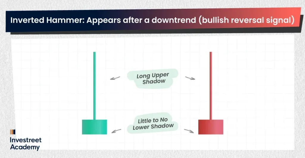
Best For:
Stock Market, Forex (especially after a downtrend, indicating a potential upward reversal).
- The Dark Cloud Cover: Not So Cloudy After All
The dark cloud cover will show up when a green (up) candlestick is followed by a red (down) one that opens above the previous day’s close but tumbles below the midpoint of the first candle. It’s like a sneaky plot twist in your favorite movie, just when you thought everything was smooth, the scene takes a sharp turn. You can mark this as a market warning sign, it’s saying: “Hey, things might be headed south.” Spot one of these, and maybe keep your metaphorical life jacket close, because prices could start sliding.
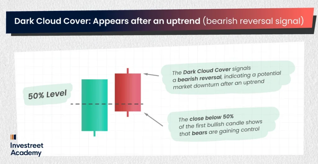
Best For:
Stock Market, Forex, Commodities (especially after an uptrend, indicating a bearish shift).
- The Piercing Line: A Glimmer of Hope
The piercing line is a two-candle pattern, starting with a red candlestick then followed by a green candlestick that opens below the previous close, but it closes above the midpoint of the red candle. The piercing line is a bullish reversal sign, and it’s like a sunray breaks through a cloudy moody sky. This indicates that the bears have been in control, but the bulls are coming in with energized sentiment, with the potential to drive the prices higher.
Tips: Experienced traders often wait for that second green candle to confirm the uptrend before getting involved, with their stop loss set just below the low of the green candle. Even a professional swimmer needs a life jacket when they explore a new water spot.

Best For:
Stock Market, Forex (ideal for spotting bullish reversals after a downtrend).
- The Tweezer Tops and Bottoms: The Market’s Synchronization Dance
Tweezer tops and bottoms are two-candle patterns that look like they’re in sync with each other. A tweezer top appears at the peak of an uptrend and signals that the price is likely to reverse downward. It’s formed when two consecutive candles have nearly identical highs, with the second candle typically being red.
On the flip side, a tweezer bottom occurs after a downtrend, signaling a potential bullish reversal. It forms when two candles have nearly identical lows, with the second being green. Think of these as the market saying, “Time to switch directions,” in perfect harmony.
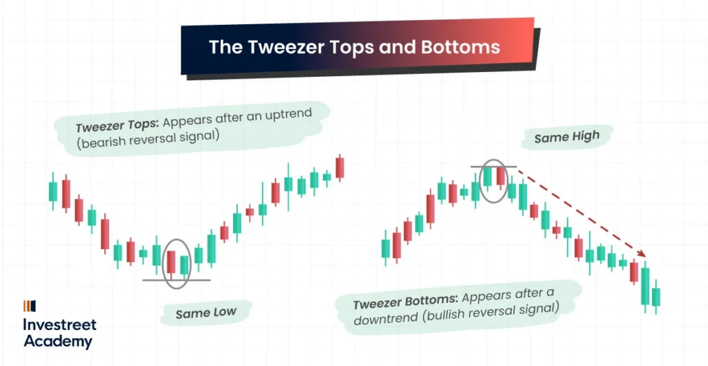
Best For:
Stock Market, Forex, Crypto (great for spotting trend reversals at key levels).
Little Summary:
By interpreting these candlestick patterns, to analyze market sentiment and smart risk management, you’ll start spotting the key trends and possible turning points across different markets. Always remember that a single candle pattern is like a crucial clue to exit the big maze, always look at the full picture and double check with other tools before making a decision. Just like searching for an exit in a maze, using some tools to leave some marks to create a safe escape route!
Top Indicators to Pair with Candlestick Patterns
To enhance the chance of profitability, think of pairing candlestick patterns with reliable trading indicators as a little extra market intuition. These tools can help confirm what the candlesticks are whispering and boost your confidence in making trades. Here are a few go to indicators worth keeping an eye on:
RSI (Relative Strength Index)
The RSI acts like a market “stress meter,” showing the current market stressiness and trend. When combined with candlestick chart patterns, RSI becomes a handy double check for spotting overbought or oversold conditions, and can hint at a reversal before it happens.
Example:
When a Bullish Engulfing pattern formed, the RSI is below 30 (indicating oversold conditions), it means the market is stretching after a long nap, prices might be ready to bounce back upward. On the other side, when the RSI climbs above 70 (signaling overbought conditions), hinting a downward move might happen.
MACD (Moving Average Convergence Divergence)
The MACD is like a market compass, it tracks market shifts in momentum and trend direction by comparing short and long-term moving averages. It’s especially handy when you want extra confidence in the signals candlestick patterns give you.
Example:
If you spot a Morning Star pattern hinting at a bullish reversal, seeing the MACD line cross above the signal line is like getting a nod from the market itself, confirming that upward momentum is picking up and the trend might really be turning in your favor.
Moving Averages (SMA & EMA)
Think of moving averages as the market’s way of smoothing out its mood swings. Pairing them with candlestick patterns will allow you to see the bigger picture of a trend and extra confidence about the direction and strength of a move.
Example:
If a Hammer pops up during an uptrend and the 50-period EMA is rising, it’s like the market giving you a wink, the chances of an upward trend still has room to run.
Bollinger Bands
Bollinger Bands are used to measure the market’s volatility and provide context for price movements. It’s like a market’s mood rings, they expand when things get wild and contract when everyone’s playing it safe. When you pair them with candlestick patterns, it gives you clues about whether the market is volatile or consolidated.
Example:
Spot a Doji hovering near the top or bottom band? It’s like the market taking a deep breath at the edge, there could be a reversal brewing after hitting those extreme levels.
Stochastic Oscillator
The Stochastic Oscillator compares a particular closing price to a range of prices over a period of time. It’s often used to identify overbought and oversold conditions, which can be critical when paired with candlestick patterns.
Example Use:
If a Bearish Engulfing pattern appears and the Stochastic Oscillator shows overbought conditions (above 80), it can confirm that the market might soon reverse downward.
Fibonacci Retracement
Fibonacci levels are like invisible rungs on a ladder that the market often climbs or bounces off; they help identify potential support and resistance levels where price reversals may occur. Combining these with candlestick patterns can give you a precise entry or exit point.
Example:
If Bullish Engulfing is forming right or around 61.8% retracement, it means a strong confirmation of a trend reversal to the upside.
These indicators, when used together with candlestick patterns, provide a more robust approach to market analysis and can help you make more informed and confident trading decisions. Each of these tools adds another layer of insight, helping you spot trends and turning points more effectively.
Interpreting Candlestick Patterns: Beyond the Candles
Okay, so now you know a few patterns, but how do you actually interpret them? Let’s break it down:
- Start Simple and Build: Pick one candlestick pattern that you understand the best, study it, and start applying it in your trades. Create a plan around it, and don’t forget to include solid risk management strategies. Mastering one pattern before adding more to your strategy is like building a house, getting the foundation right first.
- Look for Confirmation: A single candlestick pattern doesn’t always mean the market is about to flip. Always look for confirmation from the next candlestick or two. For example, a bullish engulfing pattern followed by another green candle is usually a strong signal.
- Trend is Your Friend: Candlestick patterns are best used in the context of a trend. They can help confirm what’s already happening or signal a reversal. So, if the market has been trending down and you spot a bullish engulfing, it could be a sign that the downtrend is ending.
- Don’t Get Too Excited by One Pattern: While patterns are helpful, they’re not foolproof. They provide probabilities, not certainties. It’s like reading tea leaves—sometimes they’re spot on, but other times they’re just, well, leaves.
Last Few Tips for Interpreting Candlesticks Like a Pro
- Patience is Key: Rome wasn’t built in a day, and neither are successful trades. Give candlestick patterns time to unfold, and don’t rush into decisions based on one candlestick.
- Stay Consistent: The more you practice, the better you’ll get at interpreting these patterns. It’s like learning a new language, except instead of speaking to people, you’re communicating with the market.
- Mind the Gaps: Gaps in the chart (where the price jumps significantly) are important. When paired with candlestick patterns, they can provide even stronger signals.
Candlestick Patterns Are Your Secret Weapon
There you have it! Candlestick patterns might seem mysterious at first, but once you crack the code, they’re an incredibly valuable tool for interpreting market movements. Thanks to Munehisa Homma’s rice trading wisdom, we’ve got this awesome tool at our disposal. But remember, like any tool, candlestick patterns work best when used wisely and with a little bit of patience.
So, next time you look at a chart, don’t just stare at it in confusion. Recognize the patterns, trust your instincts, and who knows? Stick to the plan, you might just make a profitable move. Happy trading!